A Redesign in a Reskin's Clothes

Updating RideAware, and What Came After
Click the headings to read more.
The app mostly worked, and that was enough to keep it off the roadmap.
RideAware, known as EverDriven VIP until the July 2026 rebrand, is how caregivers (parents, guardians, and school staff) track student trips in real time. EverDriven serves 800+ districts across 36 states and completed over 2 million trips last year. We transport students with disabilities, students experiencing housing instability, and other high-need populations. The people using this app are checking on children in transit.
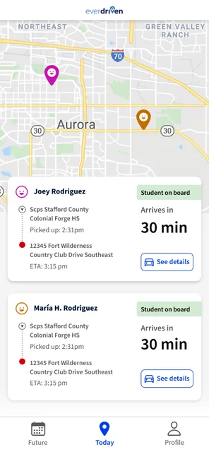
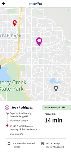
Picture a parent in the morning. They're getting their kids ready for school, getting ready for work, and they open the RideAware app. They need to know where their driver is, and the map was wrong. That failure lived in the backend, and a backend rebuild was already coming. What I could change was everything that parent saw once the app did open.
For three years I'd been asking "what if we could?" about a product the organization largely took an "if it ain't broke, don't fix it" approach to. Then three things made this the moment:
- The Technology Revolution. A company-wide replatform: a new backend ecosystem, with legacy web apps sunset in favor of more robust products. For the first time there was a reason to touch every screen in the app.
- A finished design system. It was completed in March 2025 and had never been applied to a full product. Somebody had to go first.
- A new mobile PM. They had just joined and wanted to make a mark. A proposal that had sat unfunded for years finally had the right audience.
The challenge: bring the first product into the design system and reduce tech debt through tokenization, without a mandate to change anything users would notice. I'd spent three years documenting things that needed fixing. This was the only door that had ever opened.
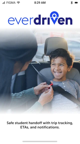
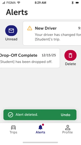
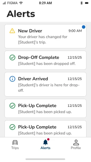
I got the product moved onto the new system by asking for less than I wanted. The first release, in February 2026, was a visual update to Material Design / MUI and onboarding standardized to match our driver app. That's the whole release. A second release in July 2026, shipped alongside the rebrand, brought back much of what I'd cut: a new trip card design, an Alerts feature, and a full microcopy pass.
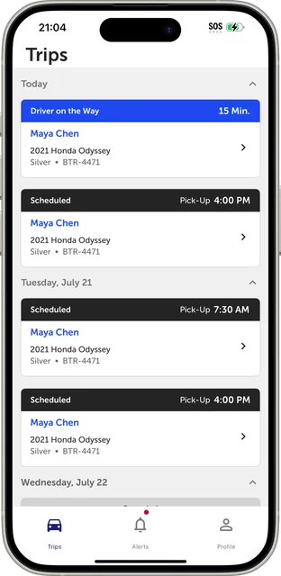
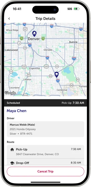
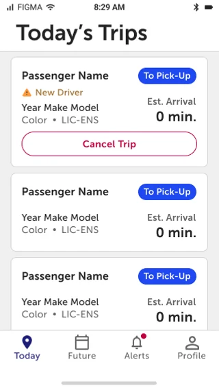
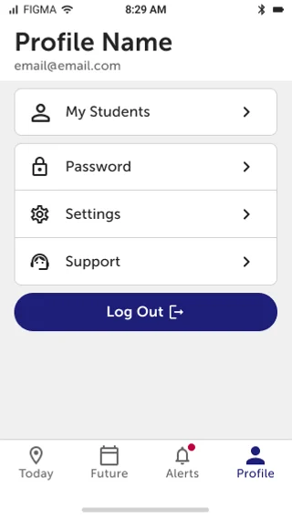
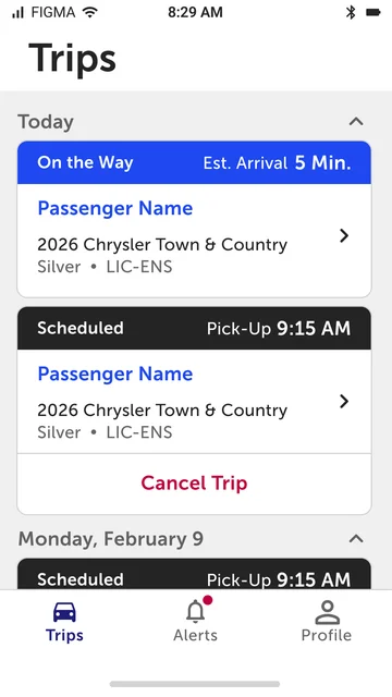
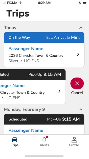
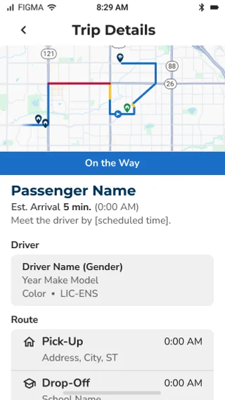
The larger change is where information lives. Vehicle details moved onto the trip card, the map shrank to a strip, trip statuses became six color families, and a mandatory school-selection gate became a filter. Almost none of it was new capability. The app already did what caregivers needed; it surfaced things in the wrong place at the wrong time.
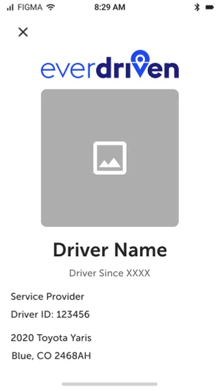
Designed but not shipped: biometric login is roadmapped, the "New Driver" rescue flag is blocked on backend support, and the driver profile is still cut.
The Work
Drawing the Whole Thing Before Anyone Asked
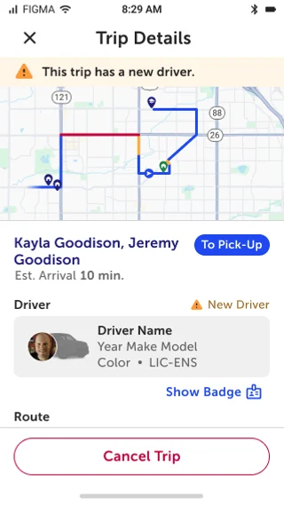
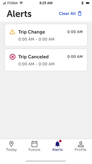
I drew the complete version in March 2025, against the newly finished design system: Alerts, biometric login, a driver profile, and a "New Driver" flag for rescues, meaning when a scheduled driver doesn't accept a trip or cancels last-minute and a different car shows up for someone's child. None of it was funded or on a roadmap. You can't take advantage of an opening if the work isn't already done.
Scoping It Back
The obvious move was to maximize scope. I did the opposite. With access to every screen, I sat with engineering and negotiated the work down until it was small enough to ship reliably as a reskin. The first release stayed that small. The foothold mattered more than the first release.
| Cut from launch | What happened to it |
|---|---|
| Alerts | Shipped July 2026 |
| Biometric login | Roadmapped |
| “New Driver” rescue flag | Blocked on backend |
| Driver badge | Still cut |
The cut list turned out to be a queue, not a graveyard. The July 2026 release was still drawing from a file I drew in March 2025, seven months before development started on any of it. The design didn't just survive being cut; it became the roadmap every later mandate drew from.
What I Learned: The rescue flag is the one that still bothers me. It's a safety-relevant gap, (imagine being a parent and a strange driver turns up at your door) and it's waiting on a platform dependency rather than a design decision. Naming that accurately matters more than claiming I chose to drop it.
Putting Information Where It’s Needed
I moved information to where a caregiver needs it, not everywhere it could go. Almost nothing here was new capability.
| Move | Change |
|---|---|
| Promote | Vehicle details onto the trip card |
| Promote | Cancel Trip onto the card, conditionally |
| Merge | ETA fused into the status band |
| Merge | Merge Today and Future Trips tabs |
| Cut | Trip start and end points off the card |
| Cut | Student roster out of onboarding |
| Convert | School selection: the gate becomes a filter |
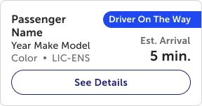
Promote what's buried. Cut what's redundant. Same move.
Demoting the Map
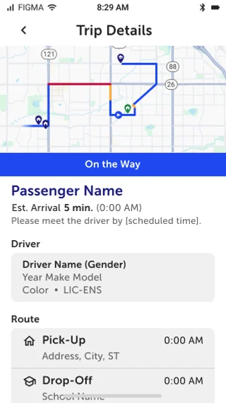
Every tracking app makes the map the hero. Ours took 65% of the screen and told a caregiver almost nothing they could act on. Meanwhile the driver's name, vehicle, and plate, which is what a parent needs when a car pulls up with their child in it, sat at the bottom of the screen, below a divider, in the smallest text on the page.
The map got smaller. On the trip list, it came off entirely. On the trip card, start and end points came off and vehicle make, model, year, color, and plate went on. A caregiver at the curb already knows where the trip goes. They need to recognize the car that's arriving.
That information wasn't new. It was already in the app, at the bottom of a detail page, where nobody found it at the moment it mattered. Availability isn't access.
A Gate That Became a Filter
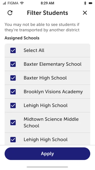
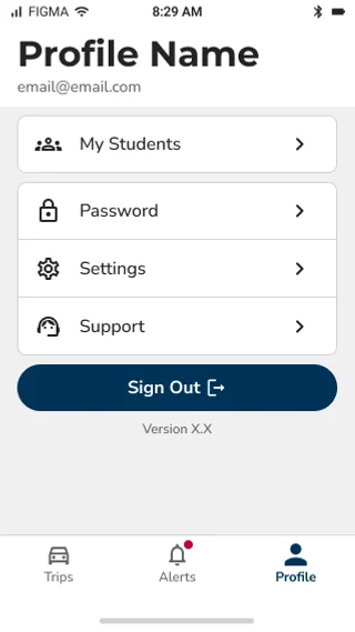
School staff opened the app into a mandatory sequence: School Select, then Student Select, then continue. Every login, before reaching anything. Now it's a Students tab, always available, with school selection acting as a filter rather than a prerequisite.
The geofence rule was wrong. It assumed one staff member equals one school equals one physical location. That's false in two directions:
- District transportation coordinators are school-based but work district-wide.
- Shared and adjacent campuses break the mapping outright, such as schools that share buildings or house each other's students.
Now, within any assigned school's geofence, staff see students across all assigned schools. This wasn't loosening a restriction. It was correcting a model that didn't match how districts actually work.
| Color | States | Meaning |
|---|---|---|
| Black | Scheduled | Pending |
| Blue | On the Way, At Pickup, On Board, At Dropoff | Proceeding Normally |
| Orange/Yellow | Running Late, Arriving Early | Off-scheduled |
| Green | Completed | Successful end |
| Red | No Show | Failed end |
| Gray | Canceled, Voided | Inactive |
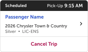
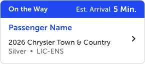
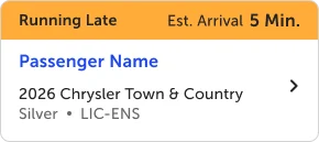
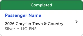
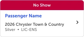
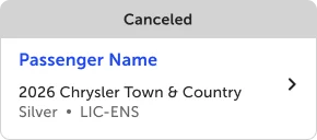
Color carries the category. The label carries the state. A twelfth status doesn't need a new color; it needs a family.
The detail I'm most pleased with: Running Late and Arriving Early share a band, but the instruction inverts. Arriving Early says "Please meet the driver by [scheduled time]." Running Late says "Please meet the driver by [arrival time]." The status doesn't just report. It tells a caregiver what to do, and the guidance changes with the state.
Designed, Not Inverted
RideAware was the first production test of our intentionally designed dark mode. It was designed, not inverted:
- Destructive red became pink, because a naive inversion turns red into cyan.
- Link blue became periwinkle.
- The Scheduled band flipped from black to white, preserving its role as the high-contrast neutral.
- Elevation is defined by borders, not shadows, because shadows don't read on dark.
Users get an explicit choice: Match System, Light, or Dark.
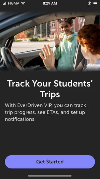
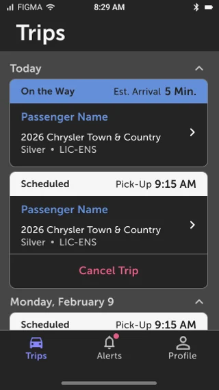
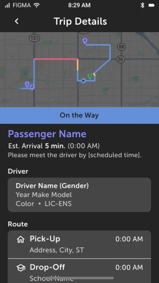
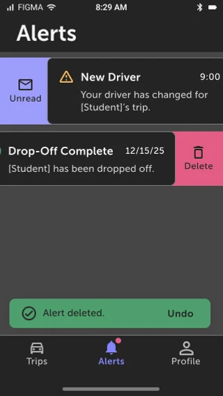
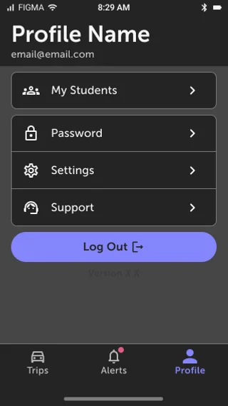
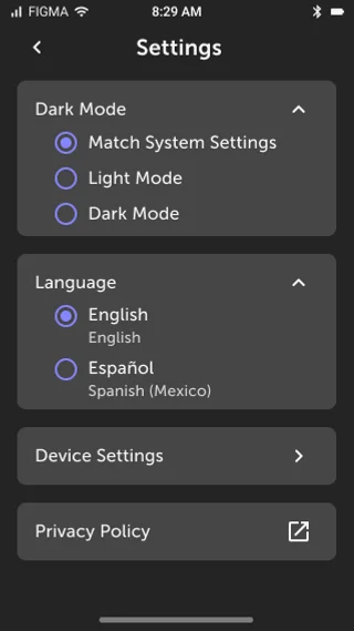
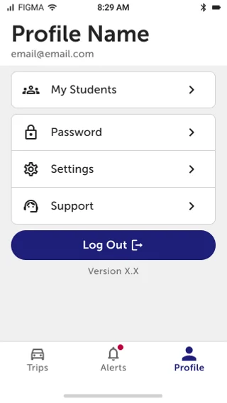
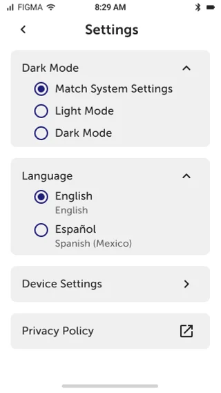
Still unresolved: white-on-dark is maximum luminance contrast, and blue-on-dark is well below it. In dark mode the passive Scheduled state can read louder than an active trip. It's under revision with the current color updates.
The VPAT gave me every screen again, and the work I'd cut from round one rode in on it. Our design team holds designs to WCAG as a standard. The design system encodes it: most components, colors, and font sizes are built to pass, and the writing guidelines carry it into the copy. So when the VPAT ran, the majority of findings were in code, not design. That wasn't luck. Bringing the app onto the system is what raised the design-side baseline in the first place. Accessibility came along with the migration whether the mandate mentioned it or not.
This was the first VPAT the company had ever run, so there was no prior baseline. The audit created one. We didn't reach AA. We hadn't met it before either, though that's an informed read rather than a measured comparison, since nothing had been formally assessed until now. What the audit established is where the remaining gaps sat: in the things design doesn't control, such as implementation, third-party components, and platform behavior. The gap was in what got built, not in what was specified. The design-side issues that did surface were small, and I fixed them quickly.
The post-VPAT release shipped compliance work bundled with a new trip card design, an Alerts feature, and a full microcopy pass. The work cut from round one rode in on an accessibility mandate.
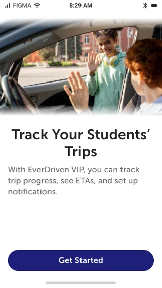
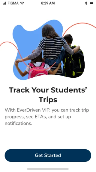
The copy pass caught things like "Driver on way to PU," internal shorthand on a screen a parent reads while waiting for their child. It now reads "On the Way." The wider pattern was replacing friendly-but-uninformative headers with descriptive ones: "Welcome to EverDriven!" became "Choose Your Account Type," and "Hi User Name," became "Track Your Students' Trips." Each change was annotated to the WCAG criterion it addressed.
Our other designer owned the VPAT and tracked non-design remediation.
What Going First Cost
Being first through the design system means absorbing the discovery cost so every product after you doesn't. Two font problems surfaced. The first was that Museo Sans lived in two files split by weight rather than registered as one family. On Android, a bold request against the 500 file can't resolve, so the OS falls back to its system default, and bold text rendered in an entirely different typeface on that one platform. The second is that fonts still aren't consistently tokenized. That one is still open. Every product after RideAware inherits these answers.
A process that exists only as tool configuration has no independent existence. Engineering's system of record was Jira, and the process was built into it: design review existed as a state in that workflow. When the Jira environment was replaced, the ticket history was lost and the workflow was rebuilt. The design review state didn't survive the rebuild, so tickets then moved through legitimately, by the new rules, past a gate nobody consciously removed.
It cost us in February: font and icon changes shipped that didn't match the mockups. The failure landed on the exact thing the project existed to fix.
It has since been corrected, and improved rather than restored. The gate now routes by change type: frontend goes to design review, backend doesn't. It's still tool configuration, though. The instance is fixed; the class of problem is still open.
Good UI is invisible. Redesign backlash is loud, fast, and lands in reviews within days. RideAware's app rating did rise afterward, from about 2.95 in February to about 3.35 by April, past where it stood before its October 2025 drop. It has since eased to about 3.2. A full visual replacement is a risk: it can cost rating points and user trust. But this change was followed by a rise, and the reskin was part of what changed. Marketing also ran a review campaign that spring, and I can't rule out that it reached the same listing.
- One of the forty post-launch reviews I could export mentioned the new look. Five months, two app stores, the entire visual layer replaced. One person noticed. AppBot caps each export at twenty reviews, so this is a sample, not every review.
- The company led its own announcement with it. EverDriven's March 2026 release named "a redesigned, intuitive user interface" as a headline feature. That's their copy, not independent coverage.
- Nobody opted in. We released in phases, then forced the update on every device within two weeks. Caregivers opened the app and the interface had been replaced underneath them. That's the condition most likely to produce backlash, and forced redesigns are what generate "bring back the old version" reviews. Every reviewer in this set was on the new app, three weeks in, without having asked for it. One wrote: "I also like the new look on the app itself!" (App Store, March 2026).
- Zero redesign complaints. The negative reviews are about notifications, driver behavior, no-shows, and connectivity. Not one person said the app got worse or preferred the old version.
- The cut list became the roadmap. Every release since has drawn from the same March 2025 file.
- The design system stopped being theoretical. RideAware proved it in production and surfaced the gaps, fonts chief among them, for every product that follows.
What I’d Recommend Next
My role was eliminated in October 2026, so these are recommendations for whoever picks this up, not work I'll be doing.
- Fold the dark mode fix into the color update. Marketing-driven color updates are already in flight. Use that pass to correct the dark mode weight inversion too, rather than treating it as a separate fix.
- Tokenize fonts. It's still open, and until it's done every product brought into the design system inherits the same font problems RideAware absorbed.
- Unblock the "New Driver" rescue flag. The design is done and it's waiting on backend support. When the backend can carry it, it should be next.
- Treat in-app notifications as real work. Surfacing them was step one, not the finish.

Reflection
Sometimes the way in isn't the front door.
I couldn't get a redesign funded. I could get a reskin funded, so I scoped one down until engineering could commit to it, shipped it, and then used every mandate that came afterward to ship the rest. Three separate openings: a migration, an accessibility audit, and a rebrand. None of them were mine. All of them moved the product closer to a file I drew before anyone asked.
What I’d Do Differently Next Time
- Sequence the accessibility audit before launch, not after. I knew the order was wrong at the time.
- Instrument releases so outcomes are separable. A rebrand and a review campaign both landed near this work. I can describe what happened, but I can't isolate it.

And the honest part: before launch, users weren't complaining about design. They were complaining that the app didn't load. Seven of twenty-four pre-launch reviews cite the same communication error. The reskin didn't fix that, and I won't pretend it did. That's what the backend rebuild is for. What the reskin did was make the next three releases possible, and those were the accessibility releases.
It wasn't the only first this year. This was the first product brought into the design system and the first VPAT. An organization that spent years on "if it ain't broke, don't fix it" started measuring itself, and this was one of the places that started.