Designing for Drivers at a Glance

Modernizing the SafeRoute Driver App
Click the headings to read more.
SafeRoute (called EverDriven Driver until August 2026) is the app drivers use to manage routes, pick up and drop off students, and reach dispatch. It launched in January 2023. When I joined EverDriven in April 2022, designs were mostly complete, and development had begun.
By 2025's "Technology Revolution," it was time for a visual update. Stakeholders were also concerned about low app store scores and wanted to improve internal performance-measuring metrics.
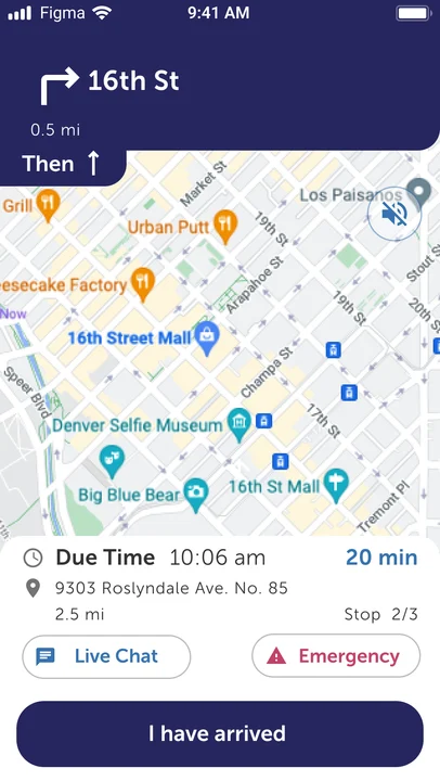
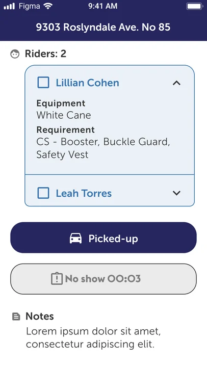
Five things stood out:
- Accessibility. The original palette mimicked brand colors that weren't WCAG-compliant, and microcopy spanned an array of reading levels over two and a half years of updates.
- Visual inconsistency. Mixed typefaces (serif and sans-serif), uneven spacing and kerning.
- An isolated visual language. It looked unlike every other EverDriven product.
- Years of features, no UX review. The interface had absorbed additions without anyone stepping back, including screens that were not implemented by the UX team.
- App store signals. Apple App Store scores were around 2.5, while Google Play hovered around 3.8.
Why This? Why Now?
- The company was already opening the app up. Engineering was migrating navigation from Mapbox to Google Maps through Google Fleet.
- The design system was ready. Tokens had just been completed. SafeRoute became the second EverDriven product to ship on the design system, after RideAware (covered in its own case study). It signaled a dedication to unifying our products under a single design system.
- Navigation was on the table. If engineering was replacing the map layer, I could propose updating the navigation UI at the same time.
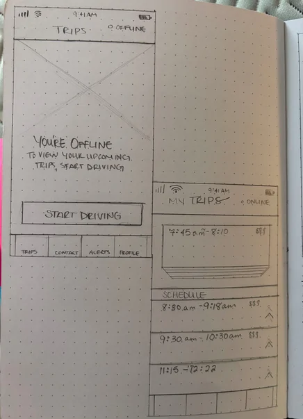
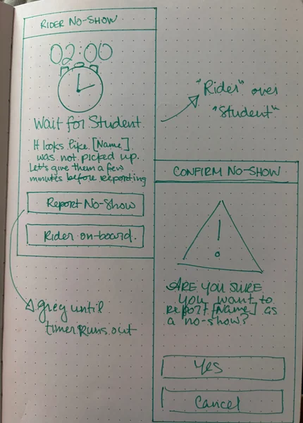
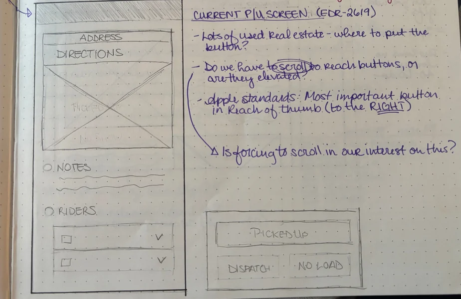
This was a long-awaited opportunity. I had sketches for the app going back to 2023 (including iterations of the navigation screen and no-show flows), and from 2024 to 2025 I designed future improvements for it, a large body of work, some of it mocked up.
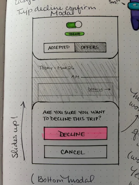
The driver app now looks and behaves like the rest of the EverDriven product family, and two parts of the driver's job were redesigned: navigating a route and handling a No Show. Three phases shipped between October 2025 and August 2026.
No formal research was done on this project. I worked from:
- Competitive analysis of Uber, Lyft, and HopSkipDrive (HopSkipDrive from publicly shared materials): navigation, pickup flows, no-show handling.
- Stakeholder input from product managers, engineering, and Customer Success.
- Customer Advisory Board transcripts and meeting notes for no-show pain points, synthesized with my Research Synthesizer Agent (Claude, Beta phase).
- Service Provider Advisory Board feedback, synthesized with my Research Synthesizer Agent.
The Work
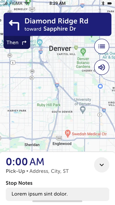
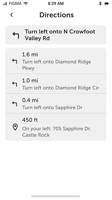
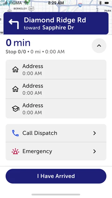
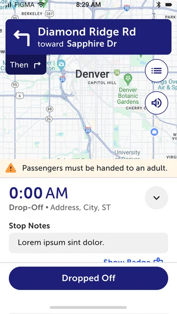
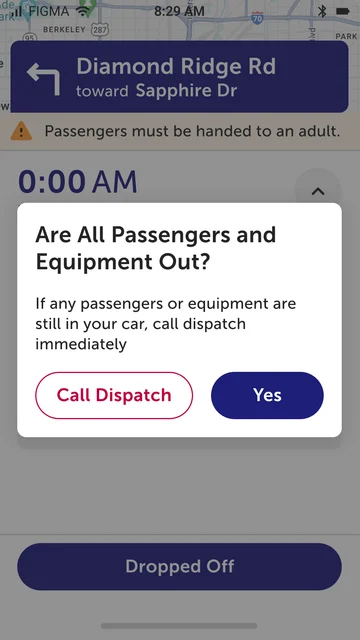
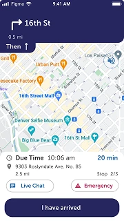
Engineering was replacing the map layer anyway, so I proposed updating the navigation UI at the same time. Engineering led the migration. It was the perfect opening to start updating the app's visual look. The call: prioritize glanceability over completeness, to reduce cognitive load while driving.
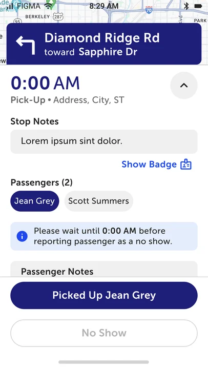
The old screen was cluttered, with too many competing elements, buttons inconsistent in size, and elements too close together. The new one is map-first, with an expandable overlay for stop details. Secondary actions are reachable but not dominant. I also added turn-by-turn directions and surfaced the driver badge in-trip, where before it lived only in the profile.
Outside navigation, we started with a straight reskin, then made UX adjustments where we could without overloading the mobile dev team's workload. It was a negotiation with the team.
Unifying with the design system had several benefits: it tokenized fonts and colors in the app, making future changes easier to implement, and brought all of the mobile products into the same design language. The adjustments:
- Swapped the online/offline button for a toggle, matching Uber and Lyft conventions.
- Consolidated all settings into one page.
- Simplified the trip card information hierarchy.
- Rewrote microcopy throughout. Claude helped develop it, guided by a glossary, brand guidelines, and reading-level rules. I made the final call on everything.
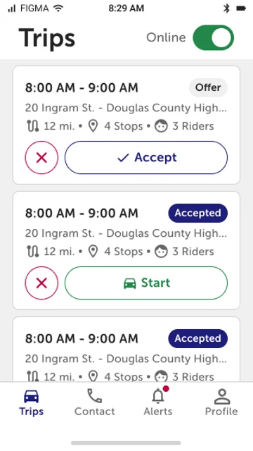
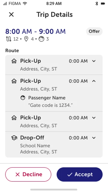
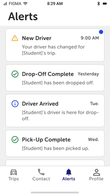
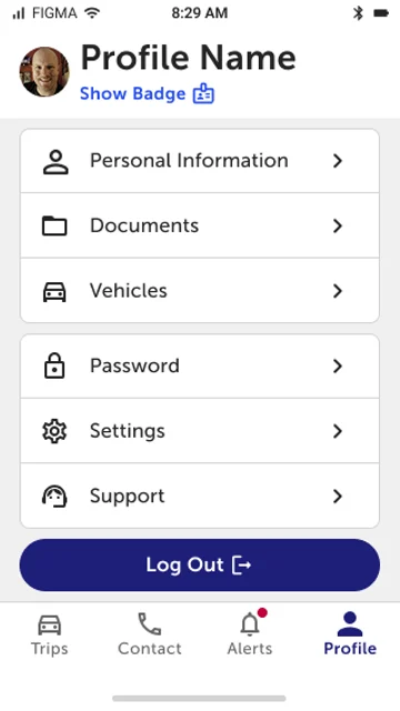
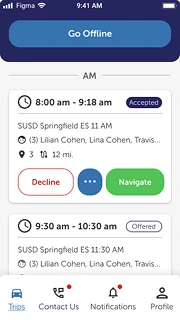
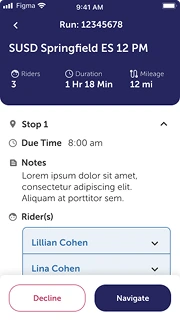
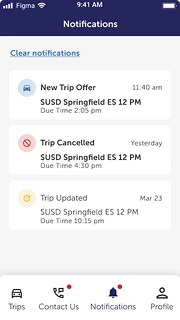
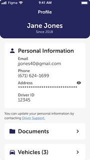
Beyond the straight reskin, I redesigned trip details around when a driver needs each piece of information, not around how the database organized it.
- Stop type, arrival time, address, passengers, and notes stay with the stop.
- Equipment is listed separately, not sorted by rider. Having the equipment matters before pickup. Who needs what matters at the moment of pickup.
- Duration removed. It came from a backend-calculated route the app never received, so showing it was misleading.
- Mileage kept. We knew it was useful to drivers.
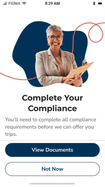
Onboarding got the same treatment. The old flow followed system logic. I reordered it around the driver's journey (Biometrics, T&C, HIPAA, Push Notifications, Profile Photo, Location, Motion & Fitness), so permissions are asked for when they become relevant. Compliance steps are deferred until a driver is eligible to drive, so a future Compliance Center slots in without another rework. I had suggested this order the year before the reskin.
Stakeholders wanted an in-app way to reverse a No Show. The backend couldn't support one, so I changed the goal: reduce the conditions that lead to reversals in the first place.
Reversing a student no show required a manual call to dispatch and a backend emulation of a pickup, which overwrote the data trail. That also meant we couldn't measure how often reversals happened. Our VP of Product acted as the mobile PM on this phase.
The pain points came from Customer Advisory Board transcripts and meeting notes (identified with help from my Research Synthesizer Agent) and from the Service Provider Advisory Board:
- Misclicks. At the bottom of the screen and below the Pick-Up button, the No Show button was easy to accidentally hit.
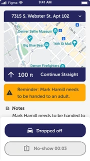
- No visible time gate. Drivers couldn't tell when they were eligible, something we'd inadvertently removed during the navigation work.
- Reversals. A student shows up after the No Show is filed, and communication is one-sided.
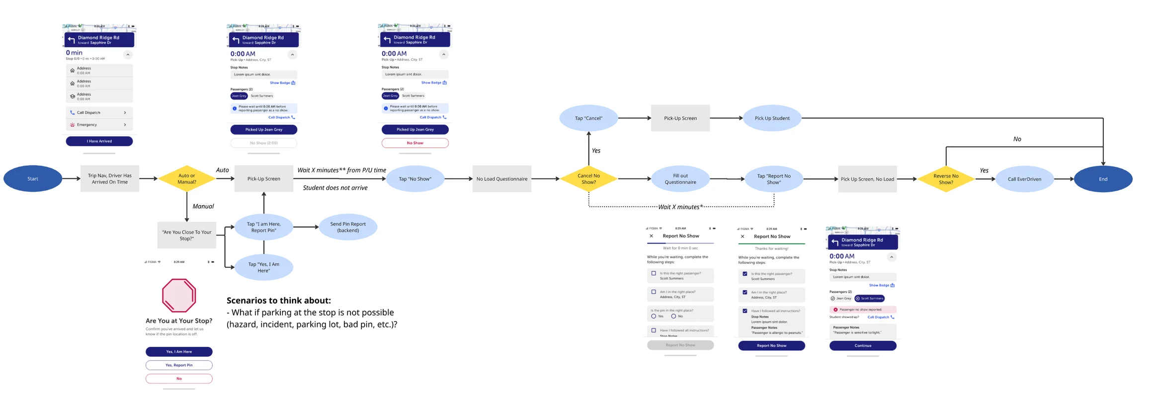
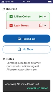
Resulting in these changes:
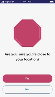
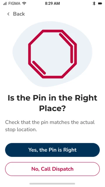
- Confirmation step: "Are you sure you want to No Show [Student]?" This addresses misclicks. Learned from HopSkipDrive's publicly shared approach, as was the questionnaire.
- Visible time gate: the button is disabled until eligible, with clear messaging about when it unlocks.
- No Show Questionnaire during the approval wait. It buys students extra time if they're only running late, and makes the wait feel intentional instead of frozen.
- The ability to leave the questionnaire if the student arrived before submission.
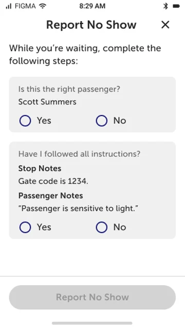
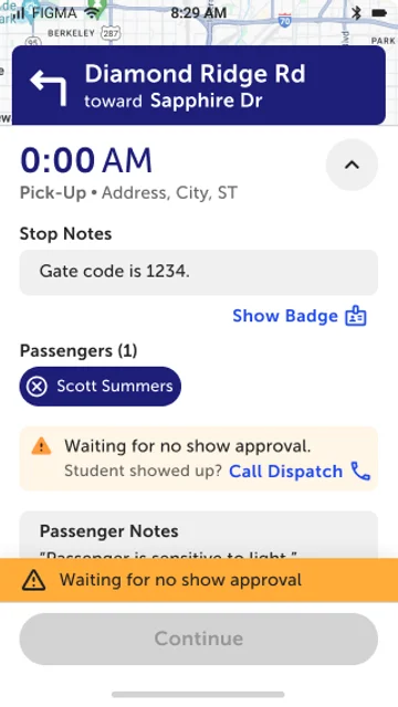
The questionnaire doesn't feed data back to the system. That was a backend constraint, and a candidate for a later iteration. I had also designed a timer and an extra field into the questionnaire screen to buy students more time. The PM for this phase decided against them, and I agreed, partly because of time constraints and partly because we aimed for a compromise between design, engineering, and stakeholder needs.
A trip rescue happens when a driver doesn't accept a trip within an hour of its start, or cancels at the last minute. Our teams then find a replacement driver. Letting drivers see trips 5 days ahead, and later accept or decline them, was meant to reduce noise for the teams handling rescues. I proposed a weekly refresh; engineering proposed a rolling view, and we went with theirs.
I didn't know how the 5-day view should work. I proposed showing a week ahead and refreshing every Sunday, an idea I'd heard from a stakeholder in earlier conversations. After investigating, engineering found that wasn't the best approach to build and proposed a rolling view instead: drivers always see the next 5 days, past trips drop off, and new trips are added every day.
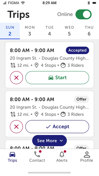
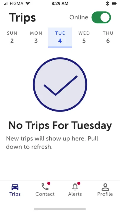
We showed the advance visibility designs to some service providers, who responded positively. The feedback was informal, not formal research.
Advance trip visibility was delayed twice and did not ship before my role ended. Advance accept/decline was design reviewed and originally scheduled for an October 2026 release. It was canceled.
What happened as a result:
- Google Play rating moved from 3.87 to 3.96 between September 2025 and May 2026.
- Apple App Store rating moved from 2.7 (July 2026) to 2.9 (October 27, 2026).
- No Show flow (shipped August 2026): no outcome data yet.
Both ratings rose in windows when my work shipped. Google Play climbed after the navigation update, and Apple moved up around the No Show release. Other releases landed in the same windows.
In addition, the tail end of this project sparked the start of a foundational research project to better understand drivers and improve the app, which in turn could improve the trip experience for districts, caregivers, and students.
What I’d Recommend Next
My role was eliminated on October 22, 2026, in a reduction in force that included the entire mobile development team and the entire design team. Here is what I'd recommend next, including work that was already planned or started:
- VPAT (formal accessibility audit): a few district RFPs were starting to require WCAG 2.1 AA compliance, so our other designer ran VPATs, starting with our district- and parent-facing products. The SafeRoute VPAT was completed in September 2026 and not acted on.
- Compliance Center: document upload before a first drive. The onboarding flow is ready for it.
- Show and enable drivers to accept/decline trips 5 days into the future to reduce noise for our teams handling trip rescues (scheduled for an October 2026 release, but canceled).
- Driver Foundational Research, to develop a driver persona and set a research base for understanding our drivers (started, not completed).
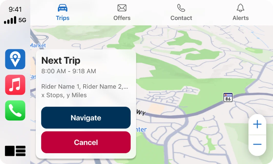
- Infotainment adaptations for Android Auto and Apple CarPlay, to help reduce app backgrounding (first explored in 2024).
Reflection
Designing without knowing the user is a shot in the dark.
While I'd collected small amounts of information about our drivers over the years, it was a huge blank spot in the company's knowledge base, and that lack of knowledge shaped how we approached our drivers and the SafeRoute app. Most of the reskin relied on existing findings and following patterns established by other companies. Our work to show more future trips was one of the first efforts that was driven by a named metric (trip rescues), and one of the first to be shown to external stakeholders for feedback before finalizing designs.
Without research, teams are guessing about what works best for the user. While drivers are one of the harder persona groups to reach, it's worth the effort to learn what they need so teams can create a better experience not just for drivers, but for the students they transport, as well as the districts and caregivers tasked with their care.

What I’d Do Differently Next Time
- Push foundational research to the beginning. The Google Maps update was a benefit to the company, and the designs that accompanied it were based on other apps, but knowing driver needs sooner could have simplified the conversations around the No Show flow and given us a clearer roadmap for work earlier.
- Conduct usability testing at each phase to validate the designs with actual drivers, not just internal UAT.